Problem / Objective
Maetri is a care intelligence platform operating at the intersection of AI, clinical documentation, and billing efficiency. As part of an initiative to refine its web presence and sharpen its value proposition, we needed to understand how comparable healthtech companies present themselves online. The goal was to extract actionable insights from peer landing pages to inform Maetri’s content hierarchy, design choices, and strategic messaging.
Importantly, the intent was not to synthesize an "average" or lowest-common-denominator landing page, but to identify standout tactics and use them to sharpen Maëtri's distinctiveness in the AI healthcare market.
Methodology
I conducted a visual competitive audit focusing on the landing pages of six relevant companies in the healthtech and medical documentation space:
- Heidi Health
- Abridge
- PredictionHealth
- Hippocratic AI
- RevMaxx
- Suki
- Augmedix
- Innovaccer
For each, I captured high-resolution screenshots of their primary landing pages, extracted textual content using optical character recognition (OCR) tools, identified key UX and messaging elements, and organized our findings into a structured comparison matrix on Miro.
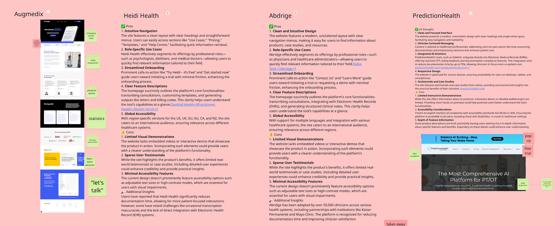
Part of the Comparison Matrix mapped onto our Miro board
Evaluation criteria included:
- Headline clarity and message framing
- Call-to-action (CTA) visibility and placement
- Accessibility features
- Role specificity in value proposition
- Visual hierarchy and use of multimedia
- Inclusion of trust signals (e.g., testimonials, case studies, compliance language)
Findings
Common Strengths:
- Clean, modern design with strong visual hierarchy (all six platforms)
- Clear CTAs like "Request a Demo" or "Get Started" featured prominently
- Messaging aligned with clinician pain points: documentation time, burnout, billing complexity
Common Weaknesses:
- Lack of accessibility signals (e.g., high-contrast mode, alt text, screen reader support)
- Sparse or generic user testimonials
- Limited use of interactive demos or video walkthroughs
Standout Elements:
- Suki included video walkthroughs and sticky navigation for persistent CTA access
- Heidi Health and RevMaxx segmented offerings by medical specialty or professional role
- PredictionHealth highlighted real-time EHR integration and compliance
See Appendix for summary of results.
Insights
Maetri can stand out by highlighting accessibility, compliance, and real-time care capture -- elements most competitors underemphasize.
Using language like "capture evidence at the point of care" reinforces both functional and philosophical differentiation of the company.
Adding explicit badges (HIPAA, CMS-compliant), quotes from early pilot users, and screenshots of AI-generated billing summaries would enhance credibility.
UI & Content Considerations from Internal Review:
- Leverage authentic photography (staff, patients) to elicit an emotional connection.
- Consider annotated walkthroughs of chatbot interactions and badge tools.
- Prioritize clean, modern UI to support trust and usability, especially for older or non-technical users.
- Explicitly articulate use case scenarios to anchor the brand’s functional domains for various users.
- Consider annotated walkthroughs of chatbot interactions and badge tools.
- Prioritize clean, modern UI to support trust and usability, especially for older or non-technical users.
- Explicitly articulate use case scenarios to anchor the brand’s functional domains for various users.
Result / Outcome
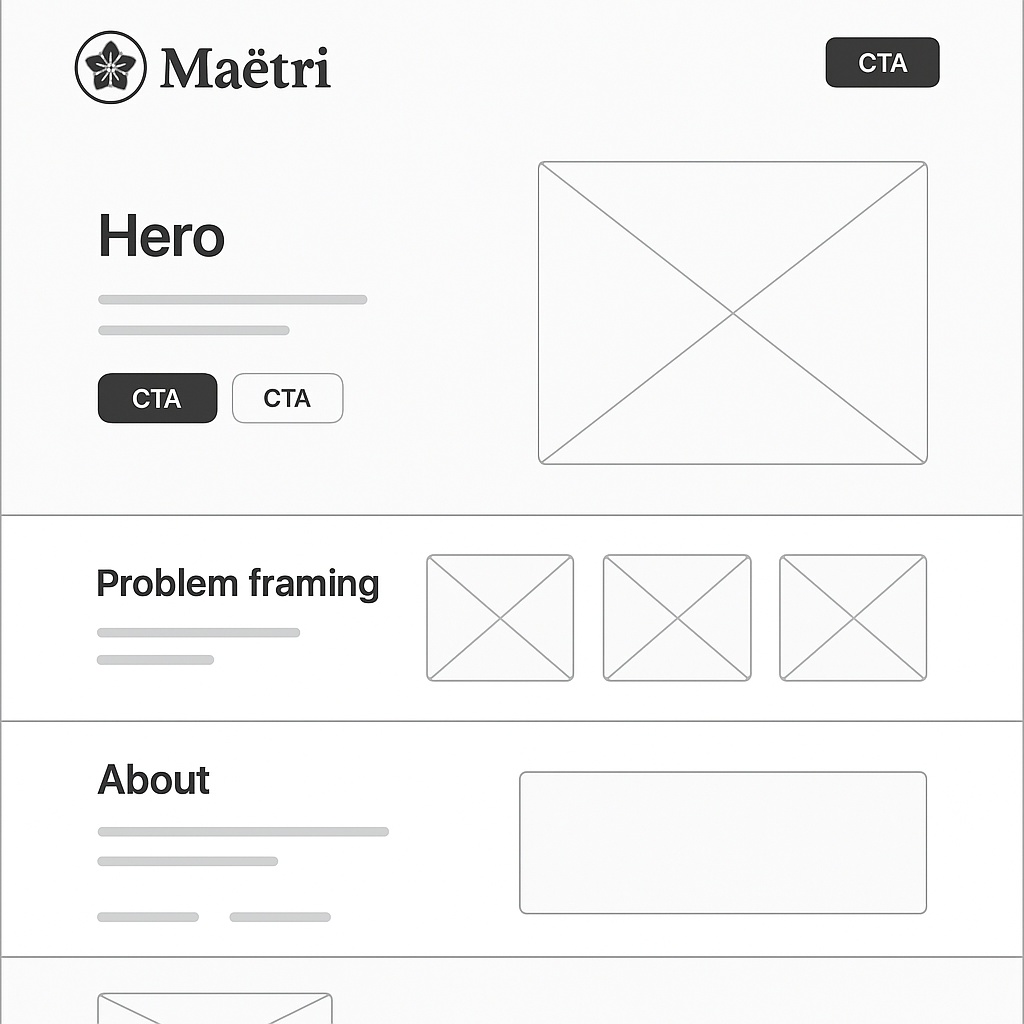
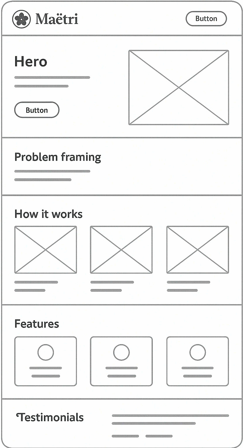
This competitive audit informed the low-fidelity wireframe mockups that explore structure, CTA placement, and content groupings based on competitive patterns and internal priorities (See Appendix). It led to recommendations for brand tone and UX affordances. Finally, it served as a key artifact in internal strategy meetings between product, design, and executive stakeholders.
Appendix: Key Comparative Takeaways
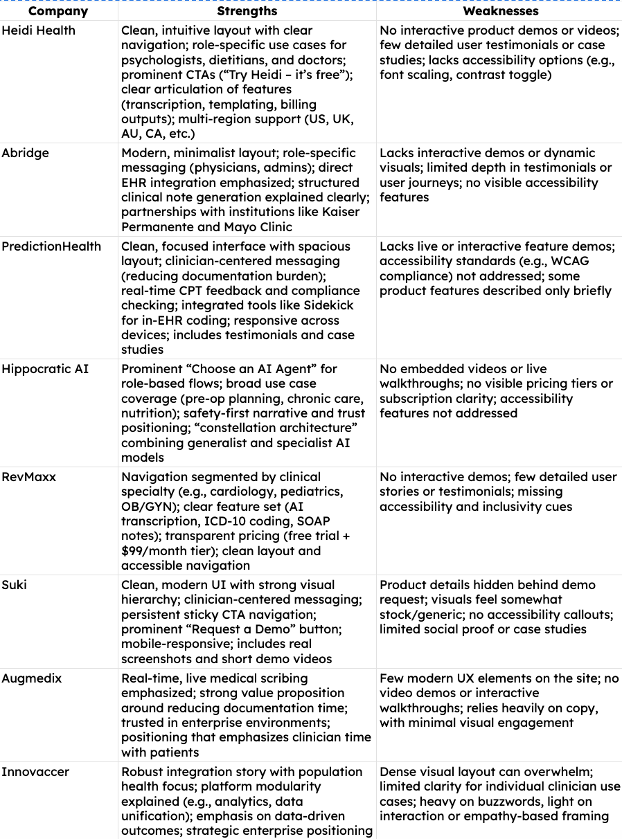
Summary of UX Audit
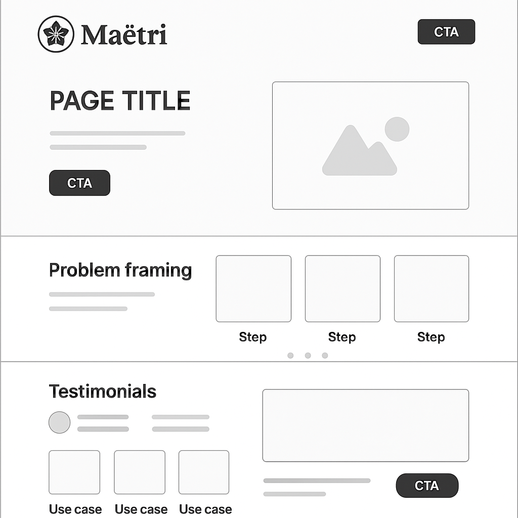
Low-fidelity wireframe 1 using GPT
Low-fidelity wireframe 2 using GPT
Low-fidelity wireframe 3 using GPT