PROJECT OVERVIEW
Trenitalia, a major Italian train service, offers a mobile app for ticket purchases. This usability study aims to identify and analyze problems experienced by users with the app's initial ticket purchasing steps. Specifically, the multiple entry points for purchasing tickets cause confusion and hinder efficient task completion. The study seeks to understand these issues and propose design solutions to enhance the user experience.
RESEARCH QUESTIONS
1. Which entry point is most frequently selected, and why?
2. How does the entry point selection impact users' perceived ease (SEQ score)?
3. What usability issues do users encounter during the ticket purchasing process?
HYPOTHESES
H1: The visually prominent "Timetables and tickets" button (Option A) will be selected more frequently than the other entry points.
H2: Users who select the "Quick purchase" button (Option B) will report higher levels of confusion and lower ease-of-use scores.
H3: Users will express a preference for a simplified and more streamlined ticket purchasing process.
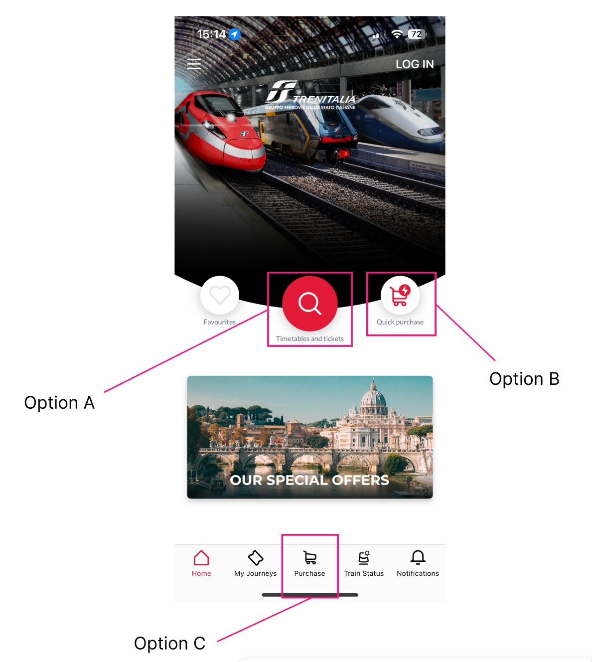
Trenitalia app home screen with three ticket purchase entry points.
METHODOLOGY
Moderated usability testing was conducted with 9 participants using a low-fidelity clickable prototype. Users were tasked with purchasing a baseline train ticket from Roma Termini to Firenze Santa Maria Novella on April 6 at 8 am.
The study employed a mixed-methods approach, collecting quantitative data (SEQ scores) and qualitative data (think-aloud protocols, post-task semi-structured interviews).
The clickable prototype and complete test plan, including the task scenario and interview questions, are available in the Appendix.
Clickable prototype of the Trenitalia app home screen used for usability testing.
PARTICIPANTS
Nine participants were recruited for the study through convenience sampling. A screening process was used to ensure participants met the criteria of having experience with online/mobile ticket purchases and limited familiarity with the Trenitalia app.
Details regarding the intended sample size calculations are available in the Appendix. While some quantitative findings were limited by a small sample size (n=9), this exploratory usability study aimed to identify key user behavior patterns and usability issues within the Trenitalia app's ticket purchasing flow through qualitative insights.
RESULTS
You can find the raw data, including the full transcripts, linked in the Appendix.
Quantitative Findings
Users who began the task with the "Timetables and tickets" button (Option A) reported higher ease-of-use scores than those who started with the "Purchase" button (Option C) (ANOVA: p = .033). Option A was also the most frequently selected entry point.
What this means: Option A was rated a more intuitive starting point for users compared to Option C. Option B went completely unnoticed.
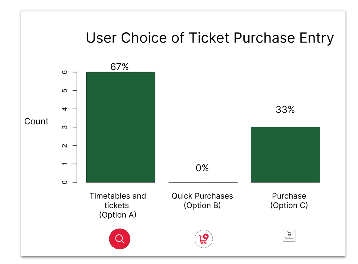
Bar chart showing the frequency of entry point selection
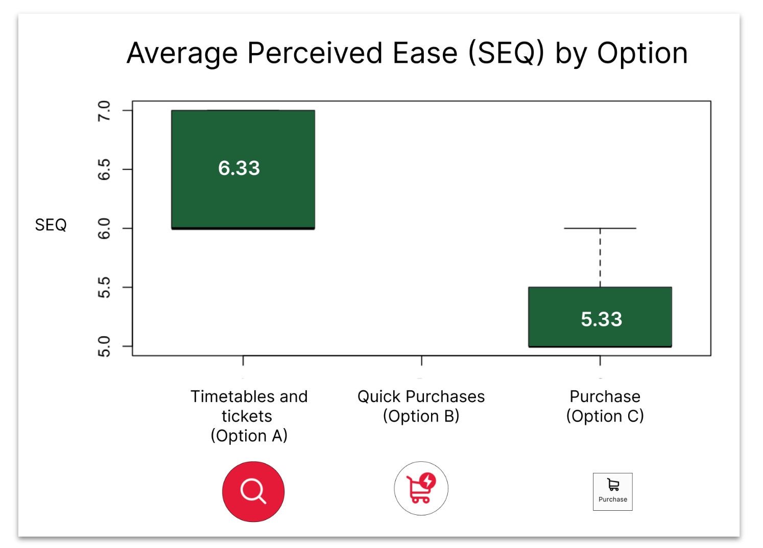
Box-plot showcasing the average SEQ scores.
Qualitative Findings
Users were drawn to Option A due to its visual prominence (size, color, icon). There was confusion surrounding Option B ("Quick Purchase"), and users expressed a desire for a more streamlined purchasing process.
What this means: Visual design and clear labeling were important for guiding user behavior and ensuring a positive user experience for Options A and C.
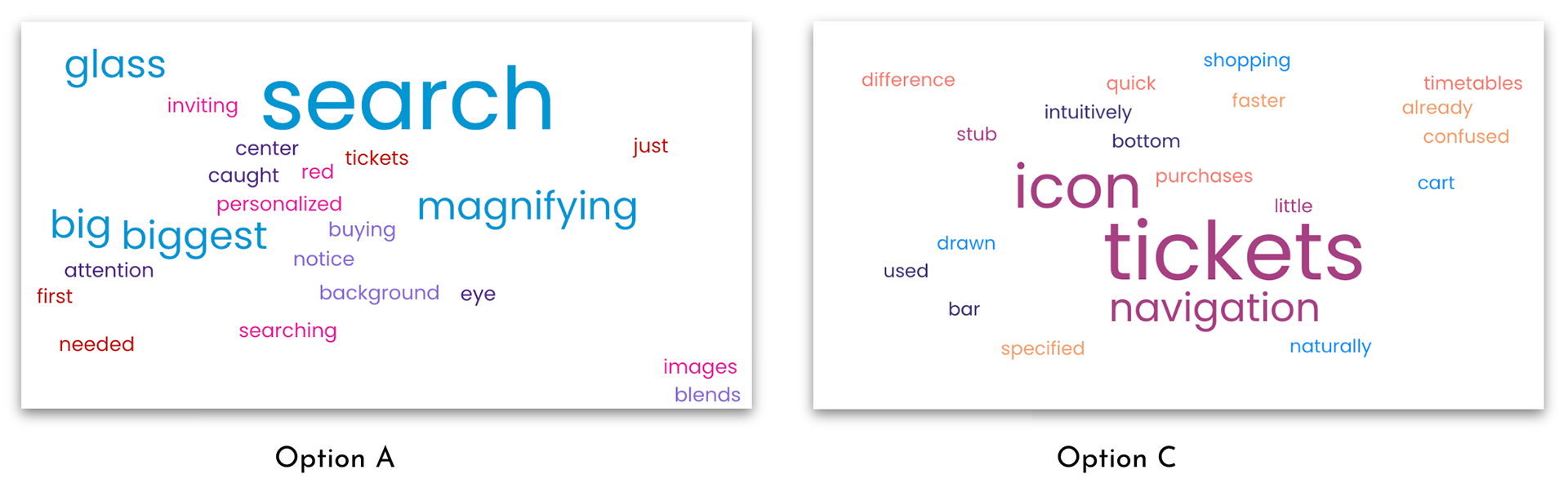
User feedback word clouds for chosen entry points.
You can find the full findings and insights write-up, including insights for each hypothesis, linked in the Appendix, but here are some more key takeaways:
Visual Prominence Drives Selection: Users were strongly drawn to Option A ("Timetables and tickets") because of its prominent visual design (large size, red color, central placement, and magnifying glass icon). As one user noted, "Well, it was big. It was red. It had a magnifying glass. These are all inviting images" (P9).
"Quick Purchase" Confusion: Option B ("Quick purchase") was universally overlooked. Users expressed confusion about its purpose and the meaning of "quick purchase," indicating a failure in labeling and a lack of user understanding. For example, one participant said, "I just thought I needed to search for the cities. I didn't really know what fast purchase meant" (P2).
Navigation Habits Influence Behavior: Some users defaulted to Option C ("Purchase") due to established habits of using bottom navigation in other apps, demonstrating how existing app usage patterns can shape user behavior.
Usability Pain Points: Users encountered frustration due to:
* Unclear distinctions between purchasing options.
* Uncertainty about pricing information.
* Cognitive overload from excessive steps and information.
* Inconsistent terminology and confusing icons.
Desire for Streamlining: Users consistently requested a simpler, more intuitive, and streamlined ticket purchasing process. As one user put it, "It could have been a little more like streamlined to just like purchase a ticket." (P1)
SUMMARY OF FINDINGS
Option A had higher satisfaction; users found it "straightforward," and we are highly confident its average ease score is between 5.79 - 6.88 (on a 1-7 scale). Navigation, terminology, and pricing were problematic across all options. Some users preferred Option C due to navigation habits, indicating it may still be useful.
You can find the full research report linked in the Appendix.
RECOMMENDATIONS
To improve clarity and reduce cognitive overwhelm, I recommend the following redesign:
* Consolidate entry points (eliminate Option B) for clearer placement.
* Simplify the bottom navigation workflow (Option C) by eliminating the middle screen, and in turn improve pricing transparency.
* Use clearer labels and terminology for the search button.
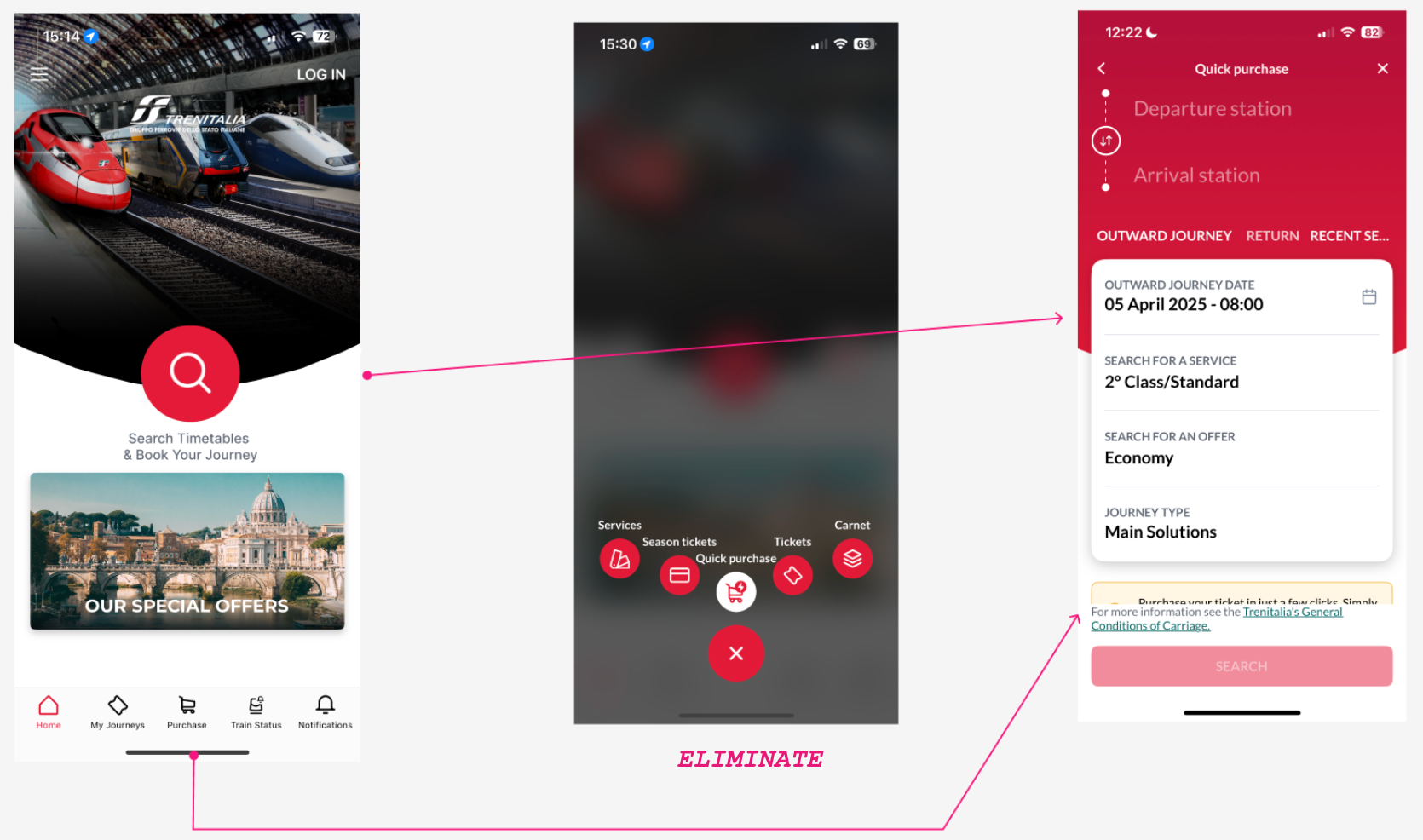
Visual mock-up illustrating key design revisions, including the consolidation of entry points and simplification of navigation.
CONCLUDING STATEMENTS & NEXT STEPS
This usability study highlighted the significant influence of visual prominence on users' selection of ticket purchasing entry points, with Option A being most frequently chosen. The findings also underscored the importance of clear labeling and consistent terminology, as evidenced by the confusion surrounding Option B. While Option A was rated higher in ease of use, navigation issues affected users across all entry points, indicating a need for a streamlined and intuitive purchasing process.
To address these issues, the next step is to redesign the app's home screen, particularly Option B and the Option C workflow. A follow-up study with a larger sample size is recommended to validate these changes. It's important to acknowledge the study's limitations, including the small sample size and focus on initial entry point selection, which may limit the generalizability of the quantitative results. Future research could explore the complete end-to-end purchasing experience and compare design iterations through A/B testing.
Interested in my UX process? Contact me to discuss this project or other design solutions.